The Pink Frog Dive Bar is not a real place, but it should be! It's got a cool 90s-early 2000s punk vibe, and a laid-back atmosphere, the type of place where a bar menu needs to be both fun and clear in the dim bar light.
This was a project where developing really strong visual hierarchy was key. With so many elements on the page, strong organization was one of the most important considerations during the design process.
The bar menu is printed on pink paper, which is how the color can stay vibrant under the dim bar-light, even more-so than a printer could. As such, the original printable file is actually white text on a dark blue background.
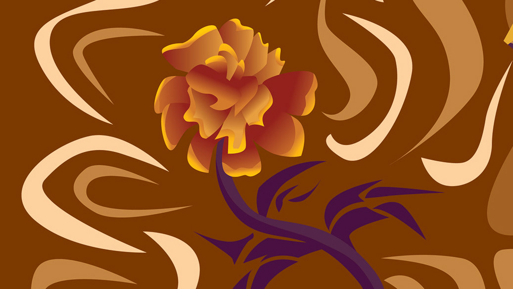
To keep it fun and playful, I tried to incorporate some rough hand-drawn elements. The purpose of them is to set a vibe and get the audience's imagination going, and I envision the interior of this bar is filled with similar kinds of decorations.
